GitHub pages 7 | Change the Design
Let’s adjust the design a little so it fits into the brand we want to represent. I don’t need to do a lot here at the moment as I already like the plain look of the default jekyll theme minima.
My biggest changes are the introduction of a secondary color instead of the grey and I want to do something with the tags
What you need to know is you have _layout and _base for your general styling and you have the minima.scss for your variables which are depicted by $
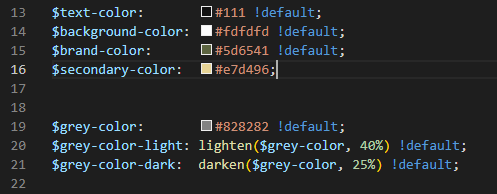
Now it’s time to think about your color scheme. you need a main color and a secondary color - for me the main color should be dark and the secondary color should be light
Basic adjustments
For the basic adjustments I want to get a primary and secondary color scheme. Then I want to adjust the current template a little bit so my colors are reflected.
_minima.scss
First we go into _sass/minima.scss. Here, we add a secondary-color variable - play around what color you like. You cam also changed the brand-color here.
simple is key here and we want to focus on content, a small resemblence to your company leads a long way - this should still be an enterprise-ready wiki
_layout.scss
Now we can adjust the _layout.scss. We only really add one thing for post-tag and then adjust the rest a little.
Also adjust the header sizes here.
You will see that the Header sizes are not yet consistent. You can adjust this within .post-content
.post-content {
  margin-bottom: $spacing-unit;

  h1 {
    @include relative-font-size(2);

    @include media-query($on-laptop) {
      @include relative-font-size(1.75);
    }
  }

  h2 {
    @include relative-font-size(1.75);

    @include media-query($on-laptop) {
      @include relative-font-size(1.75);
    }
  }

  h3 {
    @include relative-font-size(1.5);

    @include media-query($on-laptop) {
      @include relative-font-size(1.375);
    }
  }

  h4 {
    @include relative-font-size(1.25);

    @include media-query($on-laptop) {
      @include relative-font-size(1.125);
    }
  }
}
Tags
I kinda like what this guy did.
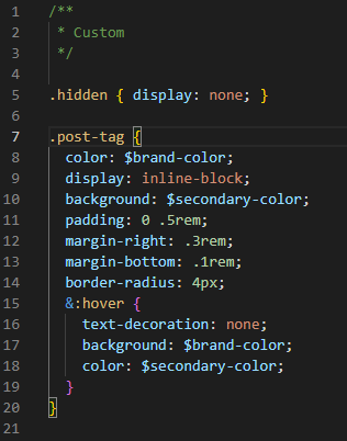
Create a new class “post-tag” - funny enough is that all the tags already have the class attached to it so we can just use it as a base. add this code to your Custom segment in your _layout.scss
.post-tag {
  color: $brand-color;
  display: inline-block;
  background: $secondary-color;
  padding: 0 .5rem;
  margin-right: .3rem;
  margin-bottom: .1rem;
  border-radius: 4px;
  &:hover {
    text-decoration: none;
    background: $brand-color;
    color: $secondary-color;
  }
}
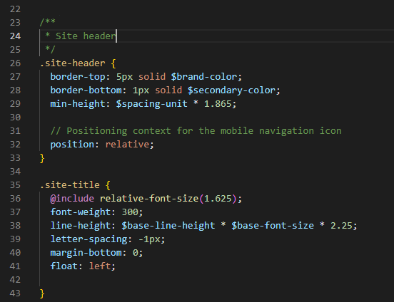
Site Header
Change the colors on border-top and border-bottom and remove the &:visited.
/**
 * Site header
 */
.site-header {
  border-top: 5px solid $brand-color;
  border-bottom: 1px solid $secondary-color;
  min-height: $spacing-unit * 1.865;

  // Positioning context for the mobile navigation icon
  position: relative;
}

.site-title {
  @include relative-font-size(1.625);
  font-weight: 300;
  line-height: $base-line-height * $base-font-size * 2.25;
  letter-spacing: -1px;
  margin-bottom: 0;
  float: left;

}
Then I changed the color of the page links to the other pages
  .page-link {
    color: $brand-color;
    line-height: $base-line-height;

    // Gaps between nav items, but not on the last one
    &:not(:last-child) {
      margin-right: 20px;
    }
  }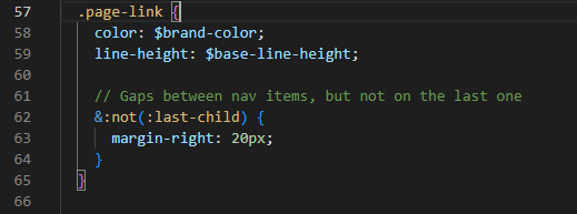
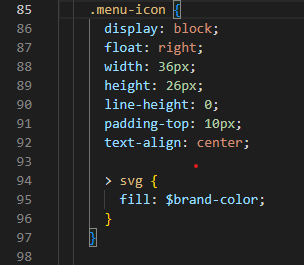
I also changed the menu icon (is showed if you narrow your screen)
    .menu-icon {
      display: block;
      float: right;
      width: 36px;
      height: 26px;
      line-height: 0;
      padding-top: 10px;
      text-align: center;

      > svg {
        fill: $brand-color;
      }
    }
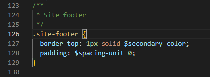
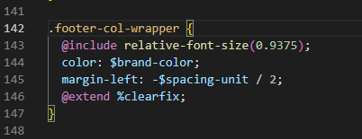
Site footer
Change the color of the border to your secondary color and adjust the wrapper of your footer
/**
 * Site footer
 */
.site-footer {
  border-top: 1px solid $secondary-color;
  padding: $spacing-unit 0;
}
.footer-col-wrapper {
  @include relative-font-size(0.9375);
  color: $brand-color;
  margin-left: -$spacing-unit / 2;
  @extend %clearfix;
}
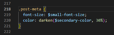
Page content
Here we just adjust the meta information for each post.
Note: Depending on you secondary color you need to make it darker or lighter so it is good to read.
.post-meta {
  font-size: $small-font-size;
  color: darken($secondary-color, 30%);
}
_base.scss
We can adjust the images, links and icons in _sass/minima/_base.scss
Images
For images I want to add a shadow to make them pop a little.
/**
 * Images
 */
img {
  max-width: 100%;
  vertical-align: middle;
  box-shadow: 5px 8px 8px #5e5e5e;
}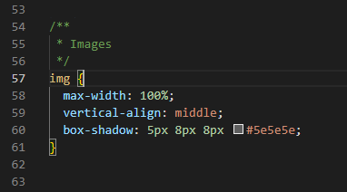
If you want to change the shadow to a “glowy” style you can als try this.
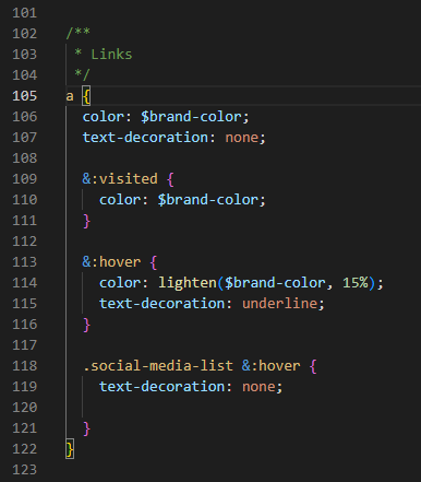
box-shadow: 0px 0px 11px #000000;Links
For the links I just removed the visited because I always find it irritating when websites have different colors for links. Other changes are colors and the underline for the social media links
/**
 * Links
 */
a {
  color: $brand-color;
  text-decoration: none;

  &:visited {
    color: $brand-color;
  }

  &:hover {
    color: lighten($brand-color, 15%);
    text-decoration: underline;
  }

  .social-media-list &:hover {
    text-decoration: none;

  }
}
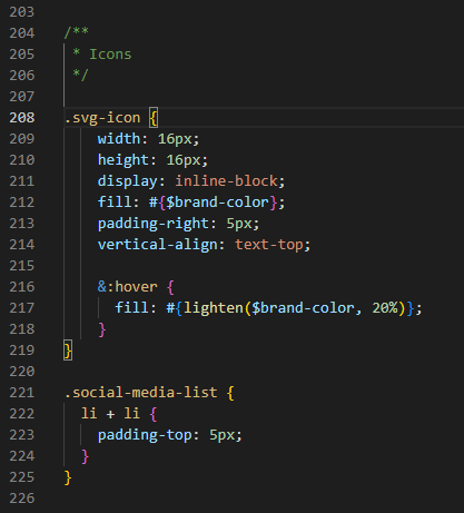
Icons
change the icon fill to your brand color
/**
 * Icons
 */

.svg-icon {
    width: 16px;
    height: 16px;
    display: inline-block;
    fill: #{$brand-color};
    padding-right: 5px;
    vertical-align: text-top;

    &:hover {
      fill: #{lighten($brand-color, 20%)};
    }
}